
“Dick’s stories typically focus on the fragile nature of what is “real” and the construction of personal identity.” (Wikipedia: Philip K. Dick)
A few week ago I borrowed some books from the public library. It has been a long while that I visited a library, but of late I found that I sleep better when I read. Even though our library is small, it is still a fascinating place, for you can roam around and run into books that I might have never rented or bought, but captured my interest and can be read without any extra cost. One of these books was a book about the coca cola. Now I am not interested in coca cola as a business, but I was interested in its use of imagery. Coca cola is a product, or even more: it is the concept of a product. And it uses pictures to bring this to your attention.
I have always been interested in pictures, when I was young a drew landscapes devoid of civilization. It is still something I like to make. When you see a picture, it invokes a certain feel or an idea. A dark forest gives you a certain feel, a busy street another. These feelings are almost universal, which is handy for that allows us to communicate via images.
Some time ago I made a post about Magritte’s pipe. He said it was not a pipe, because it was a depiction of a pipe and not the pipe itself.
I think this is a rather restricted idea in that the thing is just a thing and there is nothing more to it. If this were true, advertisements would have no use for they try to invoke a certain feel and in that way get you to buy the thing that is advertised. Although it is true that an advertisement is also a means to tell that a certain product exist and it is more then a way to present the object for sale. That is the task of a catalog and not an advertisement.
There is a gap between a thing and how it is presented. But not only between a thing, but also between people and how they present themselves to be. Advertisments are a way to bridge that gap, but stories are another way. And in another way is the use of avatars in Second Life.
At the start of the advertisement you see a picture of my avatar in Second Life. Here are two more:


In Second Life you can change your avatar as you feel fit and with each look another way of yourself is presented. These static picture do not even show the effect of the way a avatar moves. This can have an even bigger effect. I second life I have to main avatars: one is called Merit, the other is called Taubie. They have each a distinct look, but they also have shared looks. Each looks creates a new kind of identity.
Nowadays the looks are more and more shared looks.
A company like Coca Cola has to establish a idea of itself, to cloak itself and it’s product in a look. Let’s have a look Coca Cola identity.
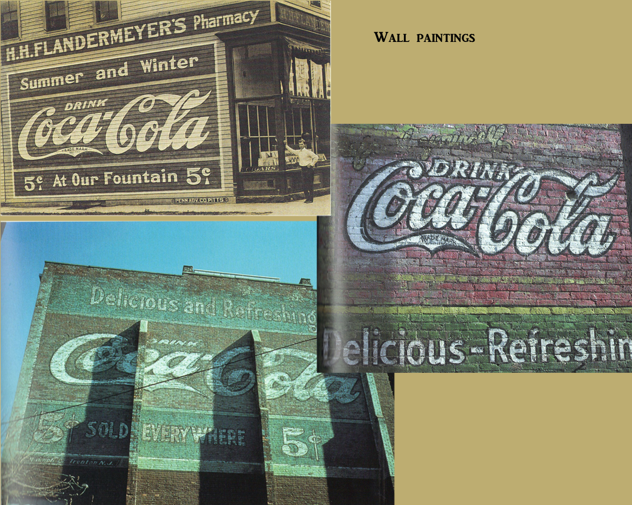
One of the first ways to advertise was to paint you advertisement on a wall. They were ready bill boards. This is what you see above. There is an old picture to the top left. And the lower two are more recent pictures although this does not mean that they were newer. Many wall paintings were walled or plastered over, to be rediscovered decades later because of renovations. Very early Coca Cola used a certain color scheme: red, white and green. Red stood for energy, white for purity and green for freshness. This is what the book I have says, it is called: The sparkling story of Coca Cola:an entertaining history including collectibles, by Gyvel Young-Witzel). It seems to me that green was dropped after some time, the books does not mention it, but you can see that in the pictures.
Notice another interesting detail that you see on the wall. It lists the price. For about five decades the price of a glass or one bottle of Coca Cola was fixed at five cent. This means that any rise in cost could not be covered by a rise in the price. A sudden increase in cost had to be covered by the Coca Cola itself, which could only reduce costs by producing less and firing staff. There were even moments in the history of the company that it almost went bankrupt. In the first world war there was a great shortage of sugar because a lot of merchant ships were needed for shipping soldiers and supplies to Europe. Sugar was mostly imported and without the ships to transport sugar Coca Cola could not meet demand. Another moment was in the thirties when the price of sugar rose at a rapid pace.
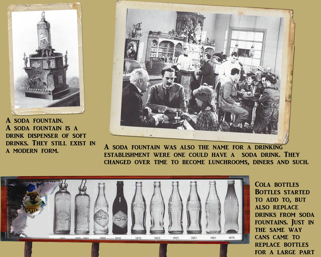
Coca Cola was a soft drink and in the early days of it’s existence it was sold via what was called soda fountains. This was the name for the softdrink dispenser as well as for the establishment itself. The syrup extract of Coca Cola was put into this machine to which water and carbon dioxide was added. This was served in a glass for the price of five dollar cents.
Soda fountains as establishment disappeared towards and after world war II. Or rather, they turned into dinners and lunch rooms. At the time of the prohibition they became more popular and Coca Cola profited from that development as well.
A soda fountain dispenser was the center of the soda fountain establishment. There were therefor often embellished.
Next to Soda fountains bottles were developed to sell soda drinks somewhat later.
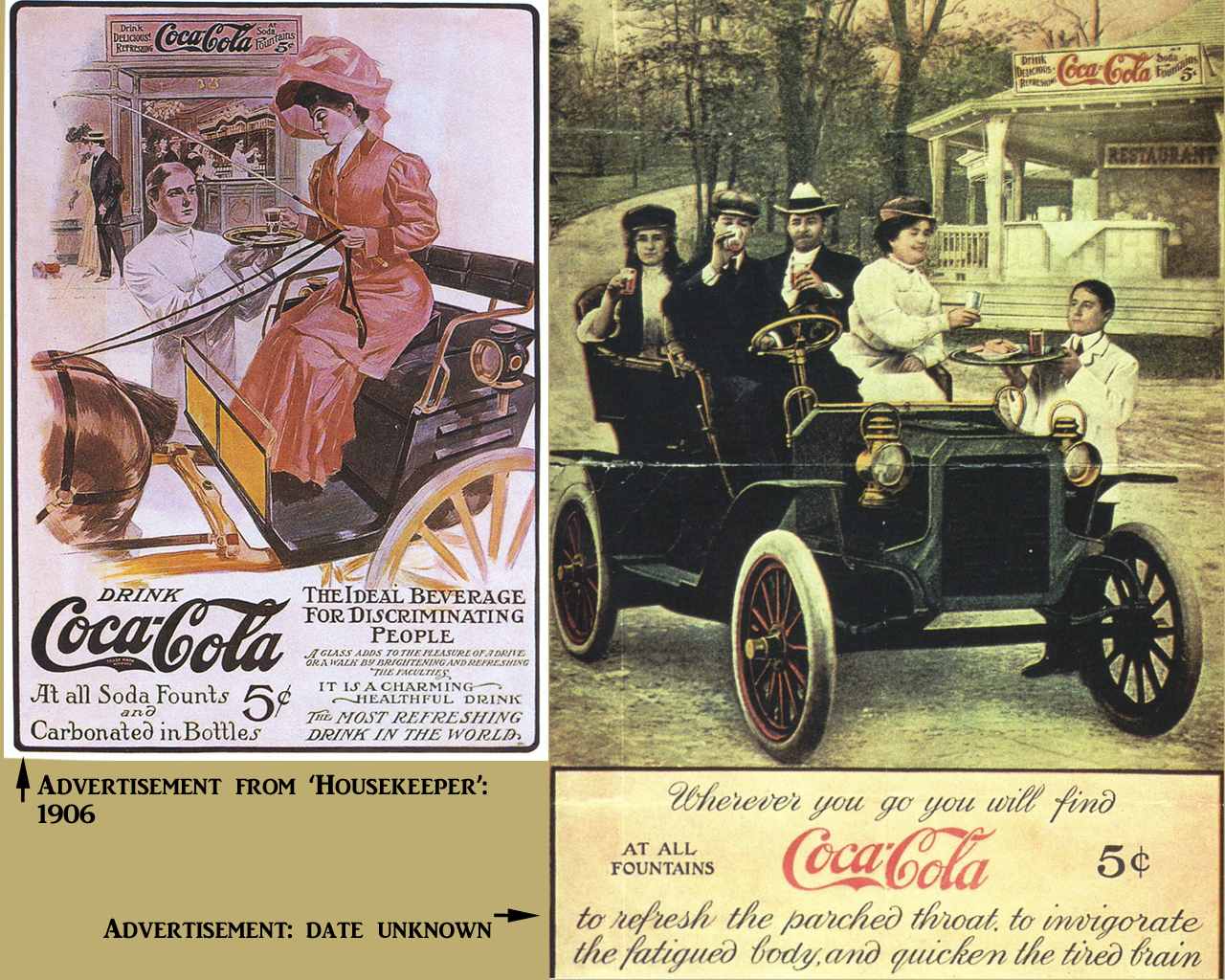
The reason why bottles started to become important can be seen in the pictures above. It was not uncommon for people to stop at a soda fountain to have a glass of Coca Cola. However with the introduction of the automobile more and more people wanted to take such a drink with them on the longer rides. Hence people wanted to have a bottle. Note the signs: a glass or a bottle costs five cents.
Another interesting this is the amount of text that was used in early advertisements.
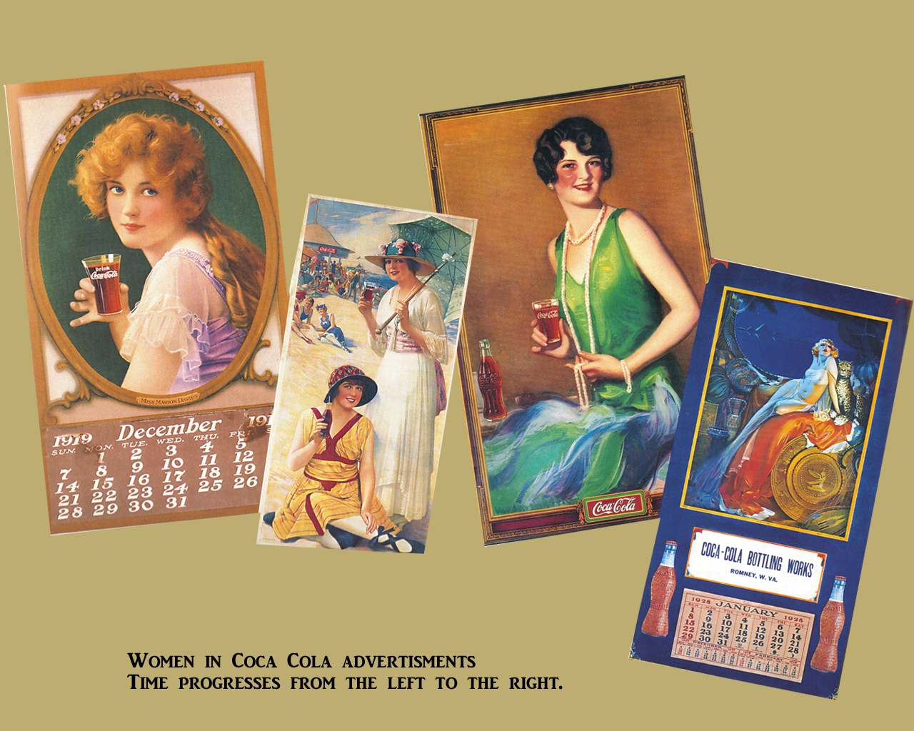
We now come to Coca Cola’s identity. Coca Cola displayed their product with women. From very early on Coca Cola published a calender showing women. Sometimes they did not even drink Coca Cola. A sample of this can be seen above. Apparently Coca Cola was convinced that displaying women had a positive effect on the sales. One of the nice side things about the above pictures is that you can see how the clothes change. This was not only because of a change in clothing style, but also a change in morals. The one on the right is actually not from Coca Cola itself, but one of the bottle companies. The writers of the books remark that this was probably not endorsed by Coca Cola and done by the bottling company on their own account.
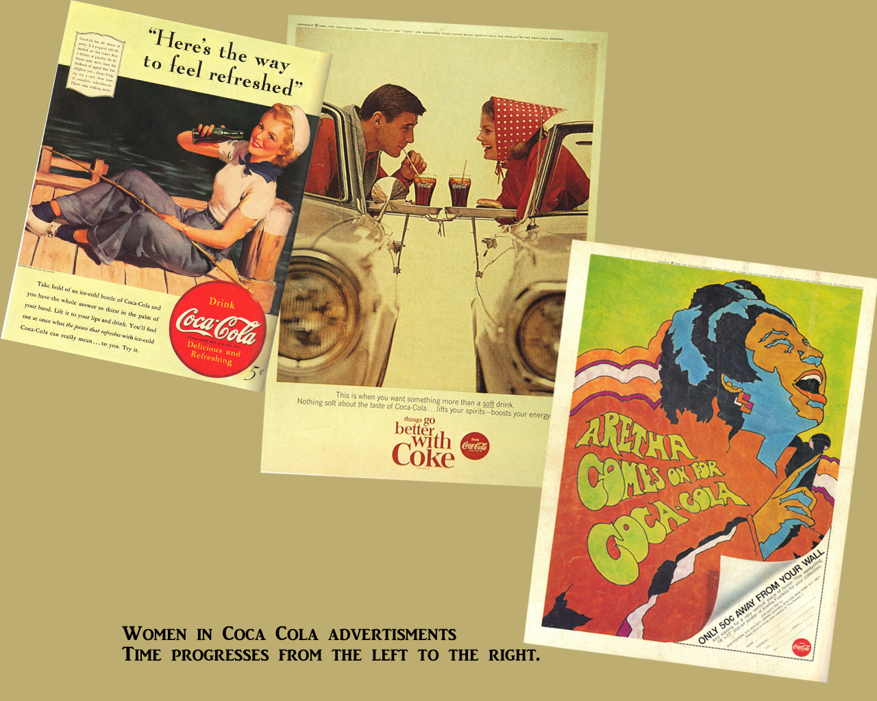
Over time women get a more equal depiction. To the right we see a picture of Aretha Franklin.
Now the depiction of Coca Cola with healthy and young women was no doubt a conscious advertisement strategy. Associate a product with attractive, young people and people might be more inclined to drink it. Mind you.. this does not say they did not use other depictions to advertise their products, one should have a look at Norman Rockwell’s works. Here is one example.
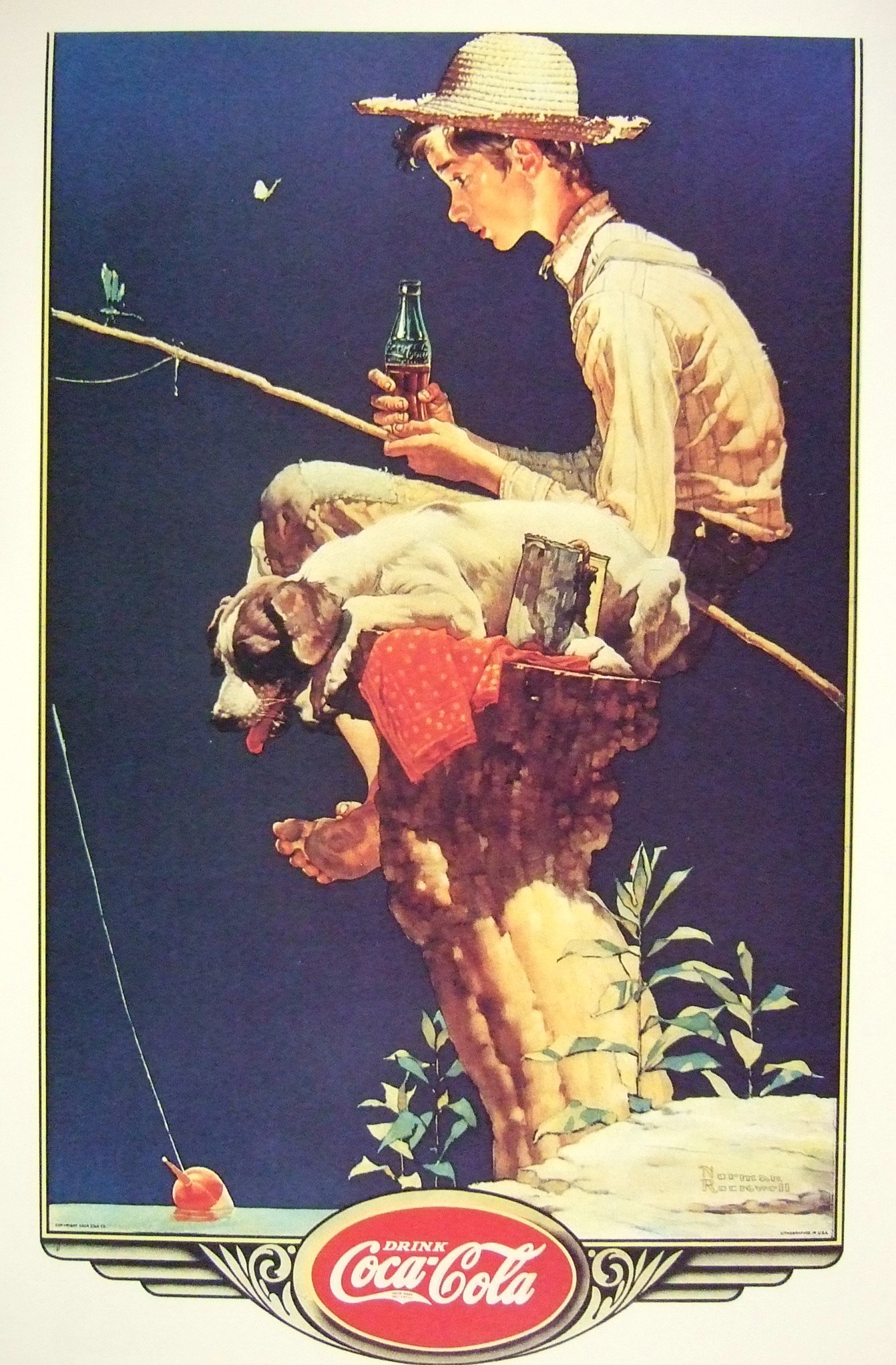
Rockwell came to work for Coca Cola in the thirties and he introduce a kind of Tom Sawyer look. It was an idyllic world. Although the boy figure looks poor, it also breathes the mood of the countryside, with is’t slow easy pace of live, with nature and people relied on each other through good and bad times. The dog was a symbol of loyalty.
Rockwell’s influence was no doubt remarkable especially when he was hired to paint Santa Claus. The combination of the two, and the use of the colors of red and white was a great find.
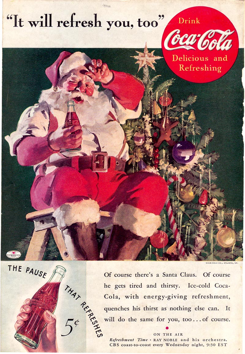
Santa Claus was another welcome concept used to advertise Coca Cola. After the 1929 crisis any good news and happiness was welcome. And Coca Cola is not shy to admit it helped shape Santa Claus into what it is nowadays. From the angle of advertisement it was perhaps a brilliant find. Well maybe too brilliant, as Santa Claus has become disconnected from Coca Cola and stands now on his own two feet. Still it was a great find.
A company like Coca Cola exist of make belief. It has to conjure up an idea that make their product attractive to you. One set way was to link their product to young, attractive and popular people. In the thirties Norman Rockwell had a roll in developing another vision: the Tom Sawyer look and Santa Claus. The image of Santa Clause has become so defined nowaday that we can hardly belief that he was more or less developed in the thirties and mostly by Coca Cola.
This manipulation of ideas is probably something to be impressed by, but also a bit daunted to. It seems that it might be possible to create imaginary things and make them part of culture. We have Santa Clause, shaped by Coca Cola and Norman Rockwell. And we have a thing like Valetin’s day. Things that were developed partly in a desire to increase sales. Of course this only works when people accept the idea. Still it is a sobering thought how fast something can become part of culture.

Leave a comment