We were at the Cobra museum last Sunday(15 September) because we wanted to see Hundertwasser. It was also a way to have a look at what the museum has to show for we had not been there for years. Cobra used to be an art movement that was active between 1948 and 1951. However it has had more influence than the shortness of the life span of movement suggests. The museum is created to collect and present the art works associated with the art movement. It also shows works that influenced the art of Cobra and the art it influenced. It is located in one the suburbs of Amsterdam. It’s not a very big museum and the surrounding area is nothing to write home about, but it’s easy to access from the nearby highway.
I wanted to write a short post about it, because I am still looking for a style that will fit my pictures better.
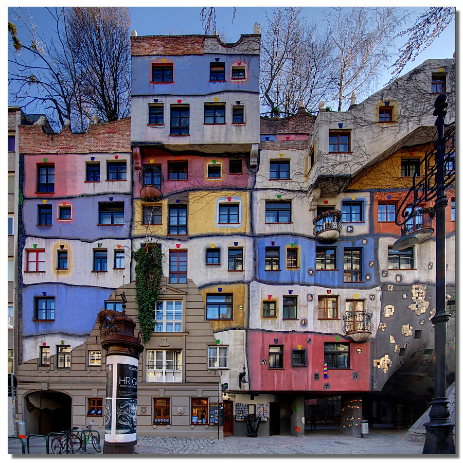

We knew Hundertwasser mostly from his buildings. Like the one on the picture to the top. A colorful scheme in which the straight line is broken.
That was his thing. He did not like a straight line because a straight line he associated with conformity. So he rebelled against it by refusing to use a straight line in his works.
At the Cobra museum we saw some of his earlier works. Works without a straight line. Here are some examples.
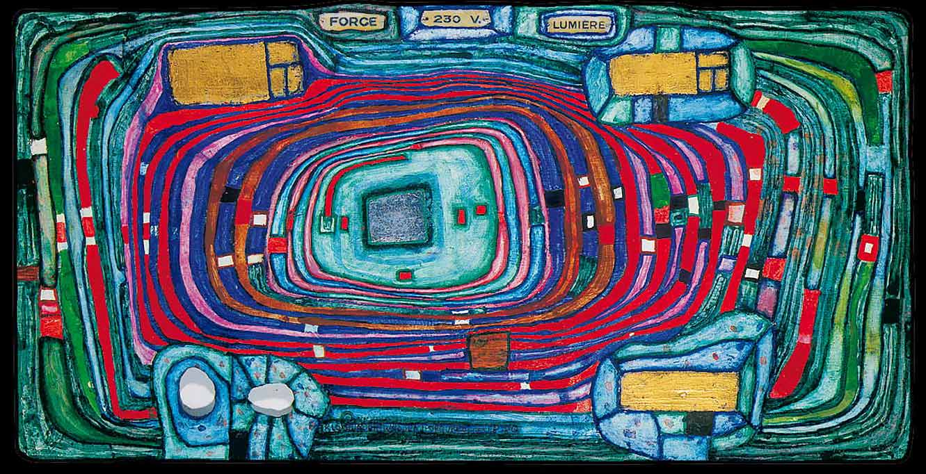
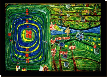
Personally I am not touched by this art. It is something that does nothing for me.. However my companion liked it very much. So much even that she bought a poster of one of the paintings and hung it on her wall. I don’t have a picture of that particular painting but it is similar to the one’s a above.
I think the style looks better as architecture than as a painting although it might make people edgy when everything is done in that same style. Incidentally, talking about doing everything in the same style: my brother used to have a few graphic novels whose stories took place in imaginary cities that were done wholly in one kind of architectural style. These novels were called Les cites obscures and made by Francois Schuiten en Benoit Peeters. They have been translated into English as Cities of the Fantastic. This English translation is a bit off in my opinion as the original French title is more sinister in sense. Which is more proper as there was something uncanny about the stories.
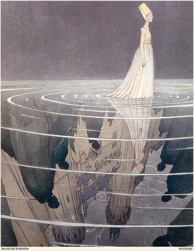
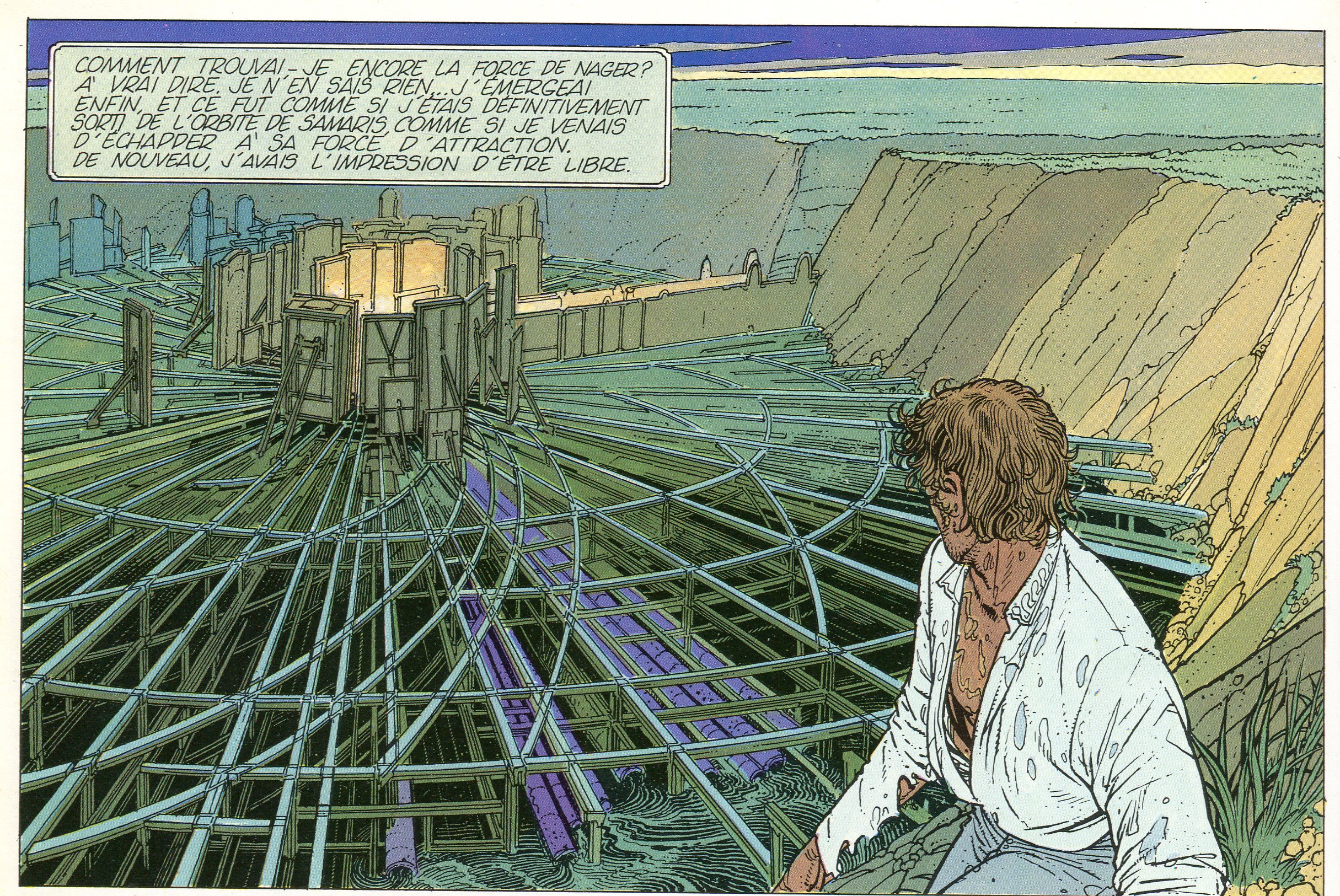
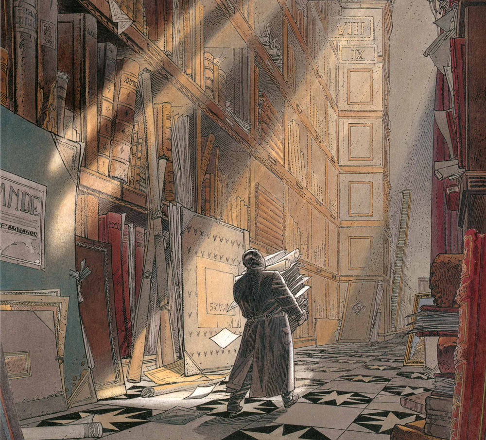
Below is picture of the first book called the Walls of Samaris.
So what are you looking at?
This is the scene at the end and show what the main character sees after he has escaped Samaris. The city does not really exist as city. Instead it is kind of trap. The unsuspecting visitor enters the city and then the city is created around him from moving panels who move over the tracks you see in the picture. In the story the hero even meets the inhabitants who turn out to be as fake as the city. It is never clear what they really are and why this city does it, but it can’t be benign as people who visit Samaris disappear. The hero eventually becomes suspicious and breaks out. But the story does not finish there. The ending is even more sinister than that.
You can find an extensive explanation of the story here http://sequart.org/magazine/3494/the-walls-of-samaris-a-classic-french-comic-you-probably-havent-read/
Next a few other pages made by Francois Schuiten, who made the pictures. Peeters was the writer. The mechanical city of Samaris with it’s straight lines is actually a menacing entity. See the straight lines in the picture below. The hero wanders through the narrow streets with tall buildings looming overhead that have all been done in a (neo)classical style. Straight lines dominate the visuals. It reminds me of Venice.
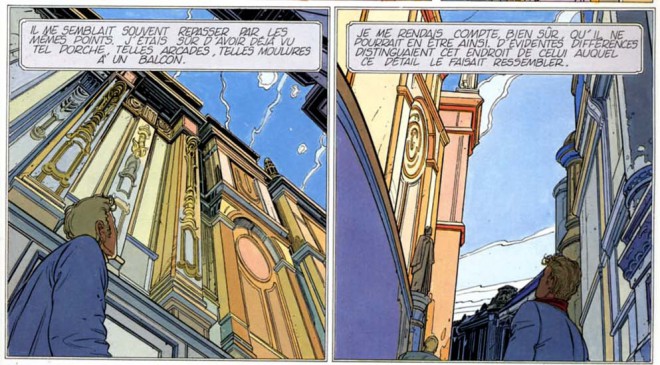
The second picture shows the hero’s hometown. It is done wholly in Jugendstil or Art Deco. Curvy lines mostly. It is fascinating to see how the visuals are used to enhance the story. Which is a very strong point in this series, although many might find it strange or unsettling.
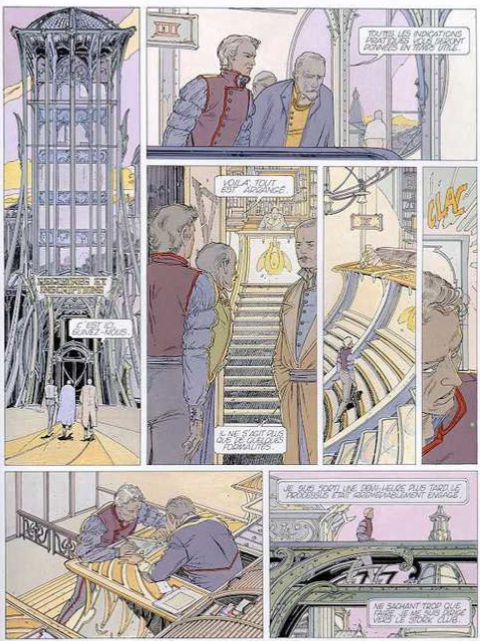
Notice that the clothes are also done in the same style. They tried to capture the Jugendstil essence and turn it into clothing. And this brings me back to Hundertwasser.
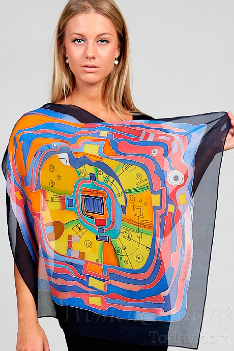
I read somewhere that Hundertwasser is getting to be more popular. And thus high art becomes popular art and thus becomes part of every day live. And perhaps that is the greatest tribute? Who wouldn’t want his art depicted on a shawl? At least there is not one straight line in it so Hundertwasser can be happy.

Since I am not much of a fan off Hundertwasser I end this post with one more example of the work from Schuiten. Enjoy!

Leave a comment